The full guide
How to make a Reels cover that works in the feed and on your profile
The cover of a reel does two different jobs. In the feed and in shares it is a full 9:16 frame that has to make people stop. On your profile it becomes a 3:4 tile, next to all your other posts, and it has to tell visitors at a glance what the reel is about.
The cover of a reel does two different jobs. In the feed and in shares it is a full 9:16 frame that has to make people stop. On your profile it becomes a 3:4 tile, next to all your other posts, and it has to tell visitors at a glance what the reel is about. Most covers are made for one of these jobs and fail at the other: a frame grabbed from the video looks random in the grid, and a title designed for the grid gets cut off when the reel is shared.
This guide covers the cover size, the part of it the profile shows, how to write a title that survives both views, and how to make a cover from your own video in a minute.
The cover size and what the grid shows
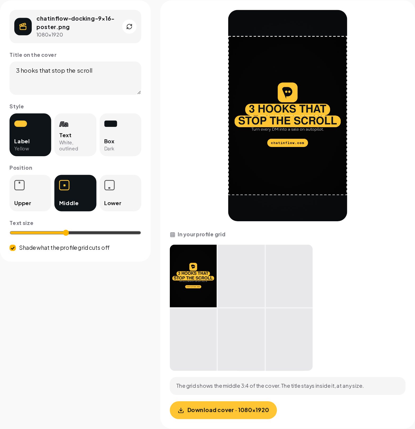
A Reels cover is 1080 by 1920 pixels, the same 9:16 frame as the reel. The profile grid shows the middle 3:4 of it.
| View | What you see of the cover | Pixels |
|---|---|---|
| Feed and full screen | The whole frame | 1080 by 1920 |
| Today's 3:4 profile grid | The middle, without the top and bottom 240 px | 1080 by 1440, rows 240 to 1680 |
| The old square grid | The middle, without the top and bottom 420 px | 1080 by 1080, rows 420 to 1500 |
The middle band is the only part every view shows. A title inside it reads in the feed, in the grid and on older layouts. A title at the top of the cover, where many templates put it, disappears from the profile.
Writing a cover title people read
A cover title is not a caption. It is three to six words that say what the viewer gets.
- Lead with the outcome. "3 hooks that stop the scroll" beats "My thoughts on hooks". Numbers and concrete results work because they promise something specific.
- Keep it short enough for one or two lines. In the grid the tile is small. Long titles turn into tiny text.
- Use bold capitals or a solid label. Thin text over a busy frame is unreadable at tile size. A yellow or dark label behind the words fixes contrast on any background.
- Put it in the same place on every cover. When titles sit at the same height across reels, the grid looks planned and visitors scan it like a menu.
- Match the first seconds. The cover is a promise. If the reel takes thirty seconds to get to the point the cover made, people leave.
Three title styles
| Style | Best for | Watch out for |
|---|---|---|
| Yellow label, dark text | Busy or colorful frames, brand-forward accounts | Too many labels in one grid feel loud; use one color |
| White text with an outline | Dark or simple frames, faces | Low contrast on bright backgrounds |
| Dark box, white text | Product shots, light frames | Covers too much of the frame if the title is long |
The cover maker offers all three and keeps any of them inside the grid band at every size.
Choosing the frame
The best cover frame usually is not the first frame of the reel.
- A clear face or a clear product. At tile size, people recognize faces and objects, not scenes.
- Eyes open, mouth closed. Frames grabbed while you talk often catch an odd expression. Slide a few tenths of a second either way.
- Space for the title. Pick a frame with a quiet area in the middle band, such as a wall behind you or a table surface.
- Consistent framing across reels. If you film at the same distance each time, the grid looks consistent even when the subjects differ.
Making a cover in a minute
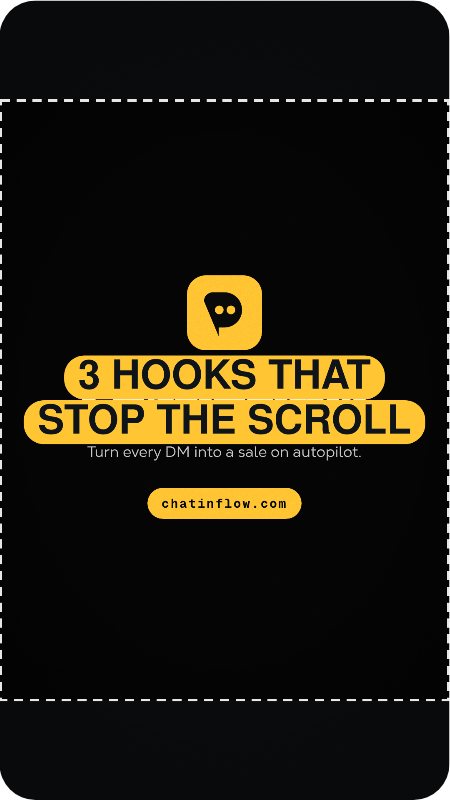
- Open the Reels Cover Maker and choose your reel or a photo.
- Slide to the frame you want. The video plays in your browser; nothing is uploaded.
- Write the title and pick the style, the position and the size. The title stays inside the middle band whatever you choose.
- Check the grid preview next to the cover. It shows your cover as a tile between your other posts.
- Download the cover as a 1080 by 1920 JPG.
Setting it as the cover
When you share the reel, tap Edit cover on the share screen and choose Add from camera roll, then pick the JPG. For a reel you already posted, open it, choose Edit, then Edit cover. Some versions of the app also let you adjust how the cover is cropped in the profile grid; check the preview there before you save.
Covers that build a recognizable grid
A series of reels with matching covers is one of the simplest ways to make a profile look professional.
- One title style for the whole account. Pick one of the three and stick to it.
- A series label. "Tip 12", "Day 4" or a small category word above the title tells visitors there is more to watch.
- Two colors, not ten. Your brand color for labels and one neutral for text. The Color Palette from Image tool can pull your colors from a logo or a photo.
- Alternate with photos and carousels. A grid made only of reel covers with titles looks like a list of video thumbnails; a photo between them gives the eye a rest.
Common cover mistakes
- A title at the very top. The grid cuts it off. Move it into the middle band.
- A frame with closed eyes or motion blur. Slide a few frames forward or backward.
- Text that is too small. If you cannot read the title on the grid preview, nobody can read it on a phone.
- Different styles on every cover. The grid looks random and visitors cannot tell your series apart.
- A cover that promises something the reel does not deliver. People feel tricked and leave in the first seconds, which tells the app the reel is not worth showing.
Fonts and readability at tile size
A cover title has to survive two reductions: the grid tile, which on a phone is about a third of the screen width, and compression. Some practical limits help.
- Size. On a 1080 pixel wide cover, titles below about 70 pixels tall become hard to read in the grid. The cover maker starts at 96 and lets you go up to 150.
- Weight. Black or extra-bold weights hold up; regular weights turn grey and fuzzy.
- Line length. Ten to fifteen characters per line keeps the words large. The maker breaks the title into lines for you.
- Contrast. Light text on a light frame, or dark on dark, disappears. A label or a box behind the words solves it on any frame.
- Capitals. All capitals read well for short titles and look consistent across a grid. For longer titles, sentence case can be easier to read.
Cover ideas by niche
| Account | A cover that works | Title example |
|---|---|---|
| Coach or educator | Face, looking at the camera, plain wall | 3 mistakes new coaches make |
| Restaurant or cafe | The dish from above, filling the frame | Our new autumn menu |
| Shop | The product in hand, close up | How to style the linen shirt |
| Salon or studio | Before and after side by side | 20 minute glow up |
| Creator | A reaction or a key moment | I tried this for 30 days |
| Real estate | The best room, wide | Inside a 2 bedroom loft |
The pattern is the same everywhere: one clear subject, a quiet area for the title, and a promise of what the viewer gets.
Checking whether your covers work
Covers are easy to test because you can change them after posting. Two signals are worth watching in Instagram's insights.
- Plays from your profile. When covers are clear, visitors who land on your profile open more reels from the grid.
- Profile visits that turn into follows. A tidy grid of readable covers makes the account look worth following.
Change the covers of a few older reels to the new style and compare those numbers over a couple of weeks. Keep everything else the same, so you know the covers made the difference.
Covers for TikTok and other apps
TikTok also lets you choose a cover frame and add text, and its profile grid shows taller tiles as well. The same rule works there: keep the title in the middle of the frame. If you post the same video to both apps, a cover with a centered title works on both.
From a reel to a conversation
A cover that gets the tap starts the reel; the call to action at the end decides what happens next. Ask viewers to comment a word for the full guide, the price or the link, and ChatinFlow's Instagram automation sends each of them a DM within seconds. The cover brings people in, and the automation answers every one of them while the reel is still fresh.
Quick answers
Where should the title go on a reel cover?
Inside the middle 3:4 band that the profile grid shows, and clear of the bottom of the frame, where the feed puts the caption.
Can I use a frame from the video as the cover?
Yes. Pick a frame from the reel itself or upload a separate image, then add the title on top.
What file does the cover maker download?
A 1080 by 1920 JPG, ready to upload as the cover in the Instagram app.
Sources
- Instagram's experimental profile grid has rectangular images instead of squares, Engadget.
- Image resolution on Instagram, Instagram Help Center.