The full guide
How to build a brand color palette from one photo
Most small brands do not start with a brand book. They start with a logo someone made, a product photo they love or a shop interior, and they want their posts to look like they belong together.
Most small brands do not start with a brand book. They start with a logo someone made, a product photo they love or a shop interior, and they want their posts to look like they belong together. A palette taken from an image you already like is the fastest honest way to get there: the colors already work together, because they came from the same picture.
This guide explains how a palette is pulled out of an image, how many colors a brand really needs, how to check that text stays readable on each color, and where each color goes on posts, stories, covers and carousels.
How a palette is pulled from an image
An image holds hundreds of thousands of slightly different colors. A palette groups them into the few that cover most of the picture.
- The image is scaled down, so the result depends on the big areas and not on noise.
- Pixels are compared in a color space built to match human vision, where two colors that look alike are also close in the numbers.
- The pixels are grouped into a handful of clusters, and each cluster's average color becomes a swatch.
- Near twins are merged, and tiny crumbs, such as the blended pixels at a sharp edge, are dropped.
- The swatches are sorted by how much of the image they cover.
The grouping starts from a fixed seed, so the same image and the same number of colors always give the same palette. That matters when you share codes with a designer or rebuild a template later.
How many colors a brand needs
Fewer than most people think. A palette with roles is easier to use than a long list of favorites.
| Role | How many | Where it goes |
|---|---|---|
| Main color | One | Labels, buttons, the call to action, highlights |
| Dark neutral | One | Text, outlines, dark backgrounds |
| Light neutral | One | Backgrounds, cards, space around content |
| Accents | One or two | Prices, stickers, small details, sparingly |
Pull five or six colors from the image, then choose the roles. Not every extracted color needs a job; some are there to show you what the photo contains.
Checking that text stays readable
A color can look great and still be a poor background for text. Contrast is measurable: it compares how bright the text and the background are, on a scale from 1:1 to 21:1.
| Text | Minimum contrast | Typical use |
|---|---|---|
| Normal text | 4.5 to 1 | Captions on images, body text on slides |
| Large or bold text | 3 to 1 | Titles, big numbers, short labels |
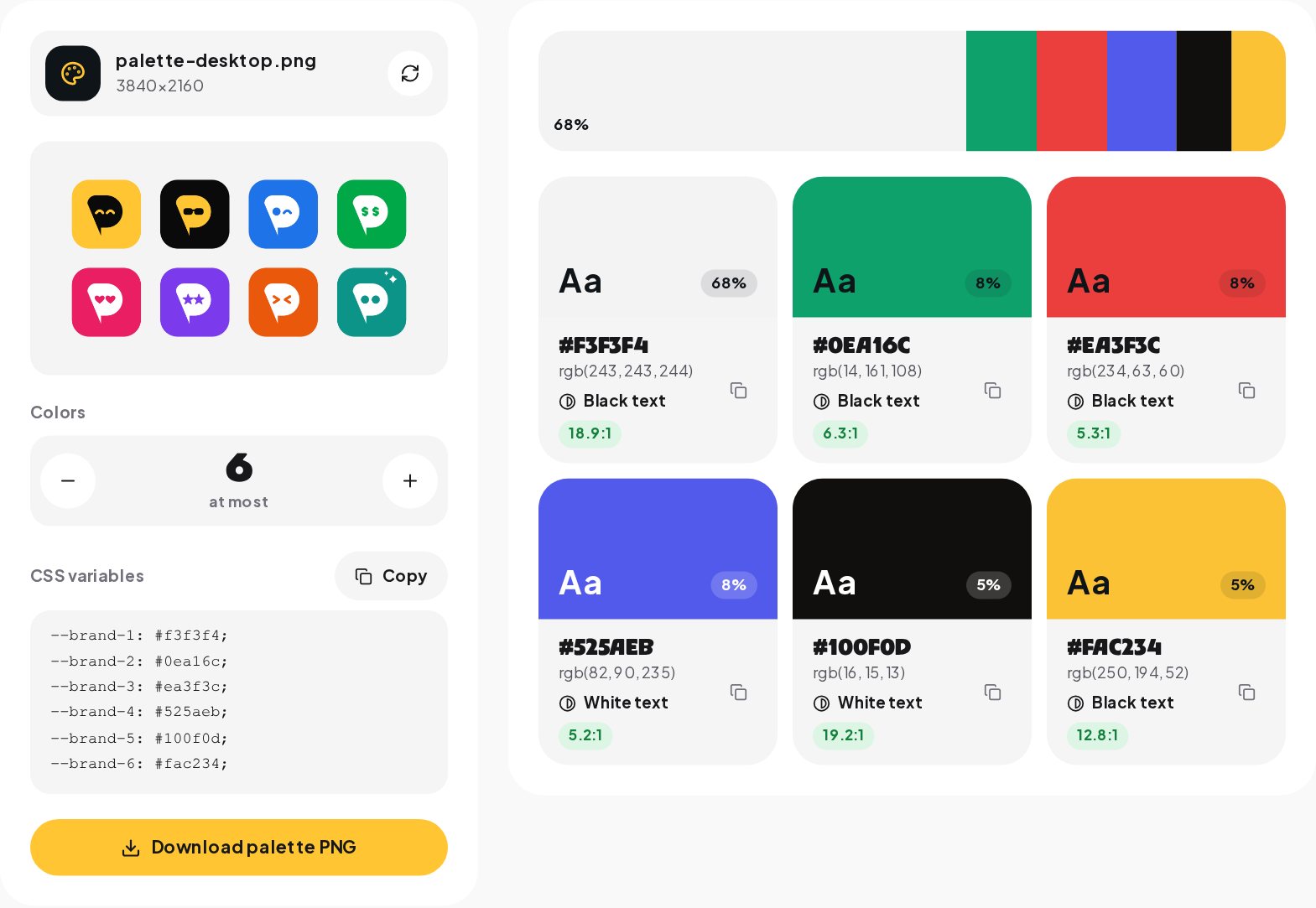
These thresholds come from the Web Content Accessibility Guidelines and are a good rule for phone screens too, where people read in sunlight and at arm's length. For every swatch the tool shows whether white or black text reads better on it and the exact ratio, so you can see at a glance which colors can carry text.
A common surprise
Bright yellows, light greens and pastels almost never work with white text. Our own brand yellow, for example, reaches only about 1.6 to 1 with white text and about 13 to 1 with black. That is why bright brand colors usually carry black text, and darker colors carry white.

Using the palette on social media
Posts and carousels
Use the light neutral as the background of most text posts and the main color for one element per slide: a label, an arrow, a number. A carousel where every slide uses the main color as a full background gets tiring by slide three.
Stories
Stories are full screen, so a solid background in the main color is a strong look for announcements. Keep the text in the dark neutral for contrast, and check that stickers and links stay away from the reply bar at the bottom.
Reel covers
A label in the main color behind the title makes covers recognizable in the profile grid. Use the same label on every cover; the Reels Cover Maker has a label style for exactly this.
Profile picture
A solid background in the main color behind your face or logo makes the avatar recognizable in comment threads. See the Profile Picture Maker.
Getting a palette in a minute
- Open the Color Palette from Image tool and choose a photo, your logo or a mood board.
- Set how many colors you want, from three to eight.
- Look at the strip to see which colors dominate, and at each swatch for its codes and readable text color.
- Copy single HEX codes, copy all colors as CSS variables, or download the palette as an image for your designer.
Choosing the right source image
- A product photo gives a palette that matches what you sell.
- Your logo gives the core brand colors, but often only two or three.
- A place, such as your shop, studio or the city you work in, gives warm, natural palettes.
- A mood board of three or four images gives a broader palette for a new brand.
Avoid screenshots with interface elements in them; the app's whites and grays end up in your palette.
From palette to three templates
A palette becomes useful when it turns into templates you can reuse every week. Three are enough to start.
- A text post. Light neutral background, dark neutral text, the main color for one highlight word or a label.
- A quote or tip card. Main color background, dark text, a small accent for the source or a number.
- A story announcement. Dark neutral background, light text, the main color for the call to action sticker.
Build them once in your design app with the HEX codes from the tool, save them, and every new post starts from a consistent base.
Checking the palette on real posts
A palette can look perfect as swatches and still feel wrong on posts. Before you commit, test it.
- Put the colors on three real posts and view them in the Grid Preview next to your existing grid.
- Look at them on a phone, at full brightness and at low brightness.
- Show them to someone who knows your brand and ask what they notice first. If the answer is a color rather than the message, the main color may be too strong.
Accessibility beyond contrast
Contrast is the most important check, but not the only one. About one in twelve men and one in two hundred women have some form of color vision deficiency, most often with reds and greens. Never use color alone to carry meaning, such as a red price for a sale and a green one for regular; add a word or an icon. And keep enough contrast between neighboring colors in charts or labels, not only between text and background.
Common mistakes
- Using every extracted color. Pick roles, then ignore the rest.
- White text on a bright color. Check the ratio; switch to black text if it is under 4.5 to 1.
- A palette that fights your photos. If your photos are warm and your palette is cold, the grid looks split. Pull the palette from your typical photo.
- Changing colors every month. Recognition comes from repetition.
Keeping the brand in the DMs too
A consistent look gets people to stop, follow and eventually message you. When they do, the conversation should feel as considered as the posts. ChatinFlow's Instagram automation answers common questions in your own words and tone, with links and buttons, so the brand people saw in the feed is the brand they talk to in the DMs.
Quick answers
How many colors should a brand palette have?
Three to eight. Most brands work with one main color, one or two accents and a couple of neutrals for text and backgrounds.
What is a HEX color code?
A six-character code, such as #FFC533, that gives the red, green and blue parts of a color in hexadecimal. Design tools and CSS both read it.
Can I use the palette in code?
Yes. The tool gives the colors as CSS variables, --brand-1 and onward, ready to paste into a stylesheet.
Sources
- Understanding Success Criterion 1.4.3: Contrast (Minimum), W3C Web Accessibility Initiative.