The full guide
How to make a seamless Instagram carousel
A seamless carousel is one picture that people swipe through. The first slide shows the start of a panorama, a design or a story, and each swipe reveals the next part, with nothing breaking at the joins.
A seamless carousel is one picture that people swipe through. The first slide shows the start of a panorama, a design or a story, and each swipe reveals the next part, with nothing breaking at the joins. Done well, it makes people swipe to the end, and every swipe is a sign to Instagram that the post is worth the time.
The idea is simple, the details are not. Every slide in a carousel has the same shape, Instagram crops the whole post to the shape of the first slide, and the joins only line up if the slides are cut from exactly the right total width. This guide covers the sizes, how to design across the seams, how to cut the image without a gap and how to post the slides so they read in order.
Why a carousel instead of one photo
A single photo gets one look. A carousel gets as many looks as it has slides, and each swipe is a small decision to keep going. That makes carousels good at things a single image cannot do: showing a whole place, walking through steps, revealing a result at the end. A seamless carousel adds one more reason to swipe, because the picture visibly continues off the edge of the screen.
Carousels also hold more information without crowding it. A tip, a price list or a before and after that would be unreadable in one square becomes clear when each part has its own slide. The trade-off is effort: the slides have to be cut precisely and designed so each one stands on its own, which is exactly what the rest of this guide covers.
The sizes that make a carousel seamless
Instagram shows feed posts at 1080 pixels wide. A carousel can be square or portrait, and all slides share the first slide's shape.
| Slide shape | Slide size | Width for 3 slides | Width for 5 slides | Width for 10 slides |
|---|---|---|---|---|
| Portrait 4:5 | 1080 by 1350 px | 3,240 px | 5,400 px | 10,800 px |
| Square 1:1 | 1080 by 1080 px | 3,240 px | 5,400 px | 10,800 px |
The source image should be the slide width times the number of slides, at the slide height. A 5,400 by 1,350 pixel panorama cuts into five portrait slides with no enlargement at all. A narrower image still works, but each slide is enlarged to 1080 pixels and can look soft, especially text.
Portrait 4:5 is usually the better choice. It takes more of the screen in the feed than a square, so the first slide has more room to make people stop.
When your image has the wrong shape
Most panoramas are not exactly five or ten slides wide. The splitter first crops the image to the closest total shape, then cuts. You choose which part to keep with a slider, so a horizon can stay in the middle and a subject on the left does not get cut off. The tool also suggests the slide count that fits the image best, which is often the most natural cut.
Designing across the seams
The cut lines are where seamless carousels succeed or fail. A swipe always stops on a slide, never between two, so every slide has to look intentional on its own.
- Keep faces and words away from the cuts. A face split between two slides looks broken on both. The same goes for a word or a number.
- Let shapes cross the seams on purpose. A line, an arrow, a wave or a road that runs from one slide into the next pulls the eye forward. It is the main reason people keep swiping.
- Give the first slide a reason to swipe. It is the only slide most people see in the feed. A question, a partial object at the right edge or a clear "swipe" cue works better than a pure landscape.
- Make every slide readable alone. People share single slides as screenshots. A slide that only makes sense with its neighbours loses that second life.
- Plan the last slide. It is where people decide what to do next. One clear call to action, a keyword to comment or a question to answer, beats a busy recap.
A simple layout that works
For a five-slide portrait carousel: a hook on slide one with an object that crosses into slide two, the content in slides two to four with one idea each, and a call to action on slide five. Keep a margin of about 60 pixels from the top and bottom of every slide for text, because the like and caption area sits right under the post in the feed.
Cutting the image without a gap
A seamless carousel only works if the slides are cut from the same row of pixels with no overlap and no gap. That is harder than it sounds in a design app, where you place five artboards by hand.
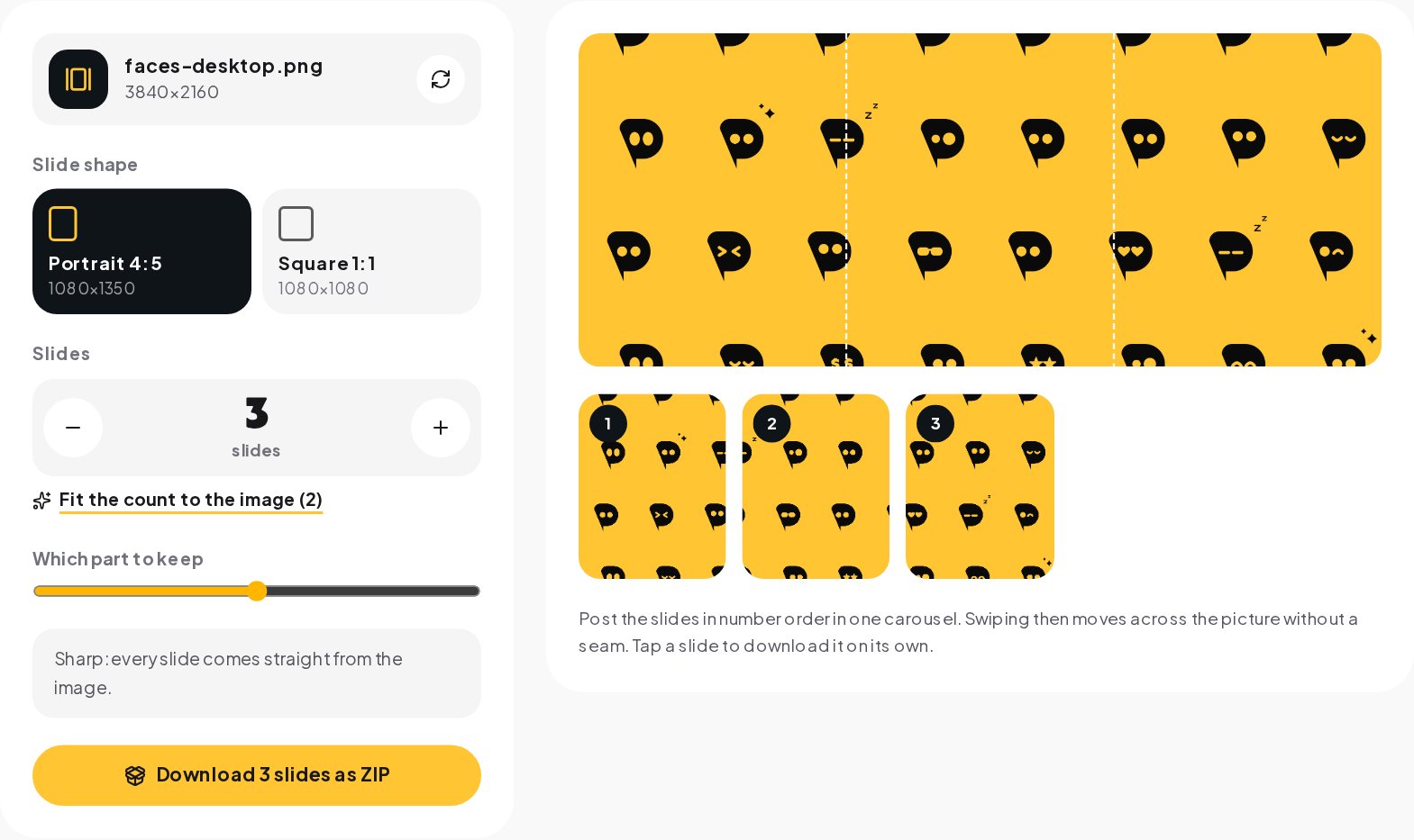
- Open the Carousel Splitter and choose your wide image.
- Pick the slide shape: portrait 4:5 or square 1:1.
- Set the number of slides with the plus and minus buttons, or use the suggested count.
- Move the slider to choose which part of the image to keep if it has to be cropped.
- Check the cut lines on the preview and the slides underneath it.
- Download all slides as a ZIP, or tap a slide to download it on its own.
The splitter computes each cut from the cropped width, so the right edge of slide one is exactly the left edge of slide two. The files come out numbered, which makes the next step easy.

Posting the slides in the right order
Instagram keeps the order in which you select the photos.
- Create a new post and tap the multiple-selection icon.
- Select the slides in number order: 01, 02, 03 and so on.
- Check the first slide's crop. If it shows a square while your slides are 4:5, tap the crop icon to switch back to the original shape before you continue.
- Do not add filters slide by slide; a filter that changes one slide breaks the join.
- Add your caption with the call to action and post.
If you schedule posts in another app, upload the slides in the same order and check the preview there too. Some schedulers sort files by name, which is another reason the numbered file names matter.
Common mistakes
- Mixing shapes. One square slide in a portrait carousel makes Instagram crop the others to match the first. Keep every slide the same size.
- Cutting in a design app by eye. A gap of a few pixels between artboards shows up as a jump in the image when people swipe.
- A source that is too small. A 2,000 pixel wide photo cut into five slides gives 400 pixels per slide, enlarged to 1080. Use a bigger source or fewer slides.
- Text that runs over a seam. It looks fine on the full panorama and broken on every slide. Keep text inside one slide.
- Forgetting the feed crop. In the feed, the bottom of the post sits near the like and caption area. Keep important details away from the very bottom of each slide.
Seamless carousel ideas that work
A seamless carousel needs content that benefits from width. These formats fit it naturally.
- Panoramas and places. A beach, a city skyline, a hotel terrace or a shop front shot as a panorama. Put the most striking part on slide one and let the rest unfold.
- Product line-ups. Five products standing side by side on one long table, each on its own slide, with the name and price above it.
- Before and after. The before on the left half, the after on the right, with a clear divider on the seam between them.
- Step by step. A path or a dotted line runs across all slides, and each slide holds one step with a large number.
- Menus and price lists. A long menu board photographed in one piece, one section per slide, readable without zooming.
- Timelines. A horizontal line with dates, from where you started to where you are now. People swipe to see the end of the story.
- Floor plans and walk-throughs. Real estate agents cut a wide floor plan or a room panorama so each swipe moves to the next room.
Exporting from your design app
Whatever you design in, export one image at the full width before splitting.
| App | Canvas to create | Export setting |
|---|---|---|
| Canva | Custom size, slide width times count by the slide height | PNG or JPG at the original size |
| Figma | One frame at the full size | PNG at 1x, or 2x and let the splitter scale down |
| Photoshop | New document at the full size, 72 to 150 ppi | Export As PNG or JPG, quality high |
| Phone panorama | The camera's panorama mode | The original file, not a screenshot |
Draw guides at every slide width while you design, for example every 1,080 pixels, so you can see the seams before you split. The splitter cuts at exactly those positions when the source has the full width.
Carousels and the profile grid
Only the first slide appears on your profile grid, and the grid shows the middle 3:4 of it. For a 4:5 slide that means a small strip disappears from each side. If the first slide has a title, keep it centered. You can preview the profile view with the Instagram Grid Preview before posting.
What makes people swipe to the end
A carousel holds attention when each swipe pays off. Give every slide a small reward: a new part of the picture, a new step, a number, a reveal. Avoid repeating the same layout five times. And end with a question or a keyword, so people who reached the last slide have something to do there.
Turning a carousel into conversations
The last slide is a good place to ask for a comment: "Comment GUIDE and I will send you the full version". People who swiped to the end are your most interested audience. With Instagram automation, ChatinFlow replies to each of those comments with a DM in seconds, so the interest the carousel created turns into a conversation instead of a notification you answer the next day.
Quick answers
How many slides can an Instagram carousel have?
Up to 20 photos and videos since August 2024. The splitter cuts a panorama into 2 to 10 slides, which keeps each slide wide enough to read on its own.
Will a seam show between the slides?
Not when the slides come from one image cut at exact widths and are posted in order. A gap appears when slides are cropped separately or shuffled.
Can a carousel mix portrait and square slides?
No. Every slide takes the shape of the first one, which is why a seamless carousel uses one shape throughout.
Sources
- Image resolution on Instagram, Instagram Help Center.