The full guide
The Instagram grid in 2026: how the 3:4 profile crops your posts
Your profile grid is the first impression for anyone who taps your name. In a second or two they decide whether the account is worth following, and they decide it from nine to twelve small tiles. For years those tiles were squares.
Your profile grid is the first impression for anyone who taps your name. In a second or two they decide whether the account is worth following, and they decide it from nine to twelve small tiles. For years those tiles were squares. Since early 2025 Instagram shows them as taller 3:4 rectangles, which changed how almost every post looks on a profile.
This guide explains what the 3:4 grid does to each kind of post, how to plan the next posts so the grid reads well, and how to turn one large image into a grid of tiles that joins up on your profile, including the order in which to post them.
What the 3:4 grid does to each post shape
The grid shows the middle of each post at 3:4. Whether the grid crops the sides or the top and bottom depends on the shape of the post.
| Post | Uploaded size | What the grid shows | Hidden |
|---|---|---|---|
| Portrait 4:5 | 1080 by 1350 px | The middle 1013 by 1350 | About 6%, from the sides |
| Square 1:1 | 1080 by 1080 px | The middle 810 by 1080 | 25%, from the sides |
| Landscape 1.91:1 | 1080 by 566 px | The middle 425 by 566 | About 61%, from the sides |
| Reel 9:16 | 1080 by 1920 px | The middle 1080 by 1440 | 25%, from the top and bottom |
Two things follow from this. A 4:5 post loses almost nothing, which makes it the safest shape for the feed and the grid at once. And a square post now loses a quarter of its width on the profile, so a logo or a word near the edge of an older square post can be cut off.
Planning a grid that reads well
People do not study each tile; they take in the grid as one picture. A few habits make that picture work.
- A rhythm, not a pattern. Alternating a face, a product and a text post gives the grid a beat without the rigid look of a checkerboard.
- A consistent edit. Similar light, colors and contrast make different photos look like one account. The Color Palette from Image tool helps you pick three or four brand colors to repeat.
- Text tiles with room. A quote or a title post should keep its words in the middle 3:4, with margins on both sides.
- Reel covers that belong. Reels appear in the grid through their cover, cropped to the middle 3:4. A cover made for the grid keeps the profile tidy. See the Reels Cover Maker.
- Pinned posts on purpose. The three pinned posts sit at the top for every visitor. Use them for your best offer, your story and your proof, not for whatever performed well once.
Checking the next posts before you share them
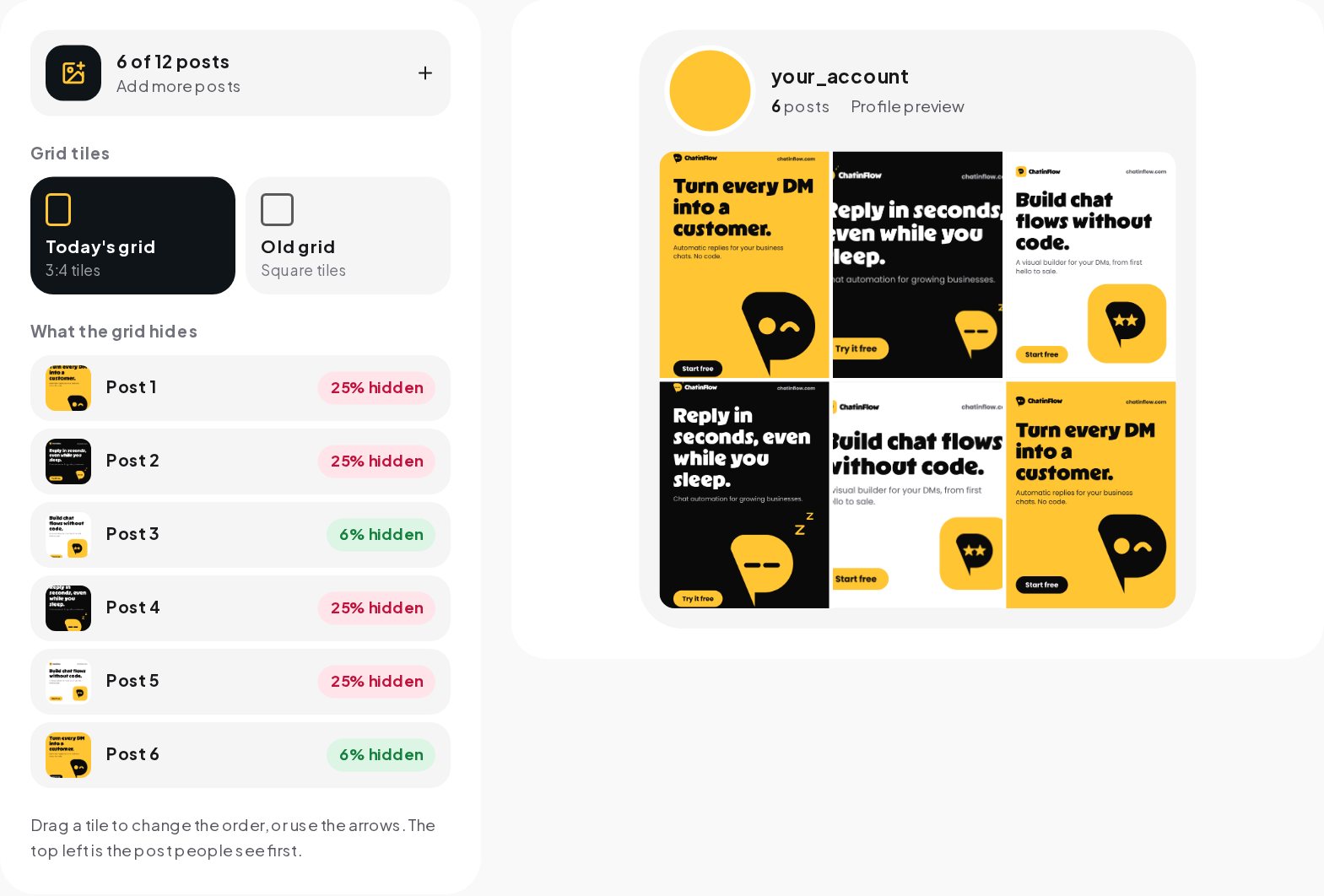
- Open the Grid Preview and choose "Plan my grid".
- Add the images you plan to post next. Each new image goes to the top left, as a new post would.
- Drag tiles or use the arrows to change the order until the grid reads well.
- Check the list of how much each post loses. Anything above about 15% is worth a second look.
- Switch to the old square grid to compare, if your audience still sees older layouts.
Splitting one image into a grid
A split grid turns your profile into one large picture: three, six, nine or twelve tiles that join when people look at your profile. It is a striking way to launch a product, announce a change or mark a season.
The tile size
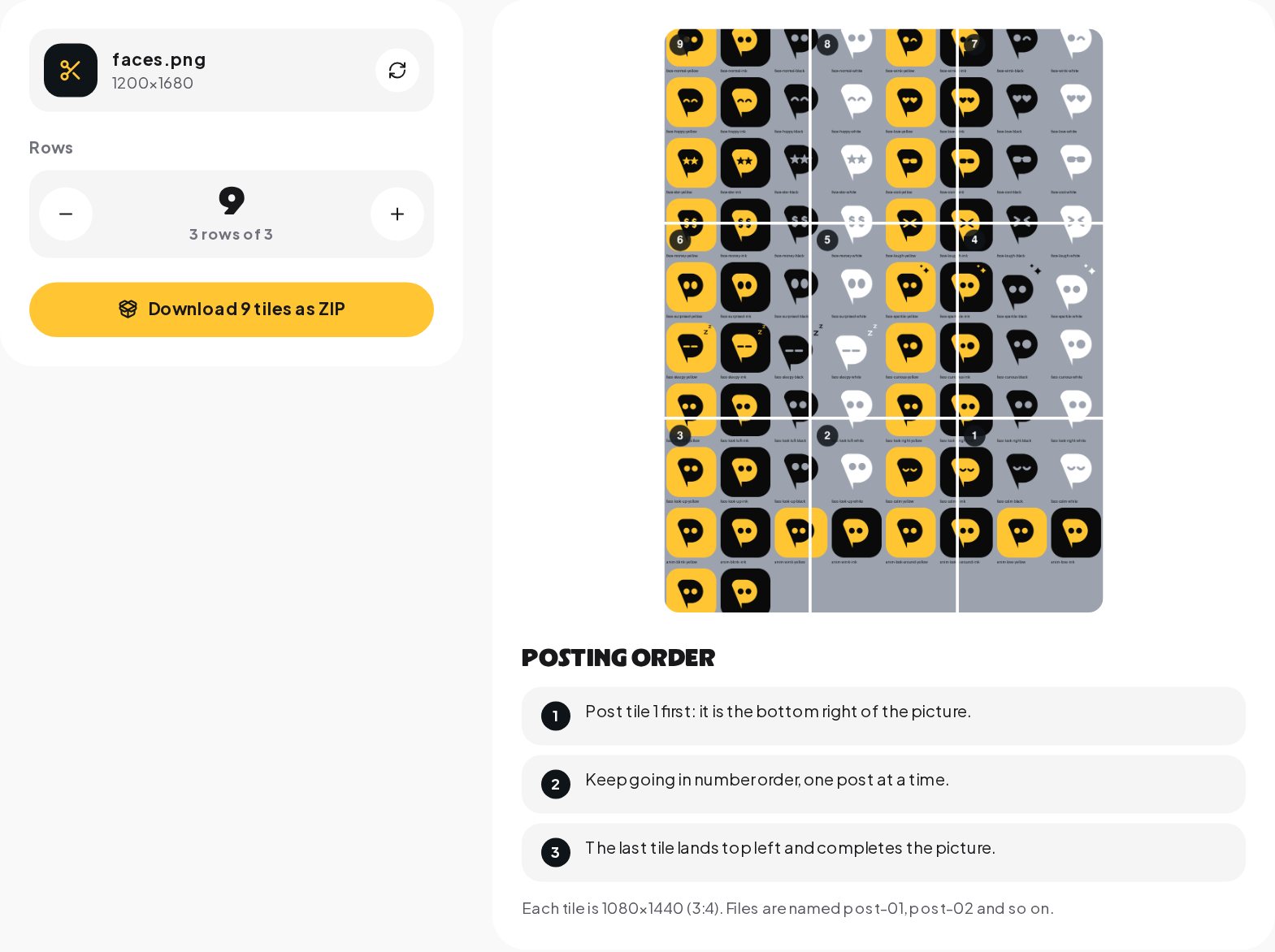
Each tile is 1080 by 1440 pixels, the full 3:4 shape, so nothing of the picture is lost to the grid crop. The source image should be three tiles wide and as many tiles tall as you have rows: 3,240 by 4,320 pixels for three rows.
The posting order
The newest post always appears at the top left of your profile. To complete a picture, you post the tiles from the end: the bottom right tile first, the top left tile last. The Grid Preview names the files in that order, post-01 to post-09, so you only have to follow the numbers.
- Open "Split one image" and choose the picture.
- Set the number of rows, from one to four.
- Download the ZIP and post the tiles in file order, one post at a time.
Before you split
- A split grid only stays together while you post nothing in between. Plan the posts in one sitting or schedule them back to back.
- Any later post shifts all tiles by one position. A split grid of three rows stays intact only if you keep posting in threes, or accept that it becomes a picture that slides down the profile.
- Each tile still appears alone in the feed. Give each one a caption that makes sense on its own and, ideally, one detail worth stopping for.
Fixing an older grid after the switch to 3:4
If your account is older than 2025, many of your posts were made for square tiles. Some of them now look cut off on your profile. You do not have to delete anything.
- Adjust the grid crop of a post. Instagram has added a way to change how a post is cropped in the profile grid: open the post, choose Edit and look for the option to adjust the preview. Move important text back into view.
- Re-cover old reels. A reel's cover can be replaced at any time. A new cover with a centered title fixes the reel's tile without touching the video.
- Archive the worst offenders. A post that cannot be fixed, such as a square with text right at the edges, can be archived rather than deleted. It keeps its likes and comments and disappears from the grid.
- Use pinned posts to reset the first impression. Even if the older rows look uneven, three strong pinned posts at the top set the tone for every visitor.
Grid ideas by account type
The best grid depends on what the account is for. These starting points work for most businesses and creators.
| Account | A rhythm that works | What to pin |
|---|---|---|
| Shop | Product, product in use, customer photo | Bestseller, how to order, reviews |
| Coach or consultant | Face, tip as text, result | Your story, free guide, booking |
| Restaurant or cafe | Dish, place, people | Menu, booking, location and hours |
| Salon or studio | Before and after, process, team | Price list, booking, reviews |
| Creator | Reel cover, photo, carousel | Best reel, about you, brand deals |
Repeat the rhythm across rows, not inside them. Three products in a row look like a catalog; one product per row with other content in between looks like a brand.
How many posts to plan ahead
Planning nine posts ahead is enough for most accounts. It covers the first screen of your profile on most phones and gives a clear view of the rhythm. Business accounts that post daily can plan twelve to see two weeks at a time.
A planned grid also makes posting faster. When the order is decided in advance, each day's post is a matter of writing the caption, not choosing what to share.
Common grid mistakes
- Square posts with text near the edges. The 3:4 grid hides a quarter of a square post's width. Keep words centered.
- Landscape photos. They become narrow slivers in the grid. Crop them to 4:5 before posting or use them inside a carousel.
- Reel covers with titles at the top. The grid cuts 240 pixels from the top of a reel cover.
- A grid made only of text. Text posts work as accents. A grid of nothing but quotes looks like a slide deck.
- Changing the edit every week. A new filter for every post makes the grid look like several accounts.
Reading what the grid does for you
A profile grid is not measured directly, but its effect shows in a few numbers in Instagram's insights: profile visits, follows from profile visits and the share of reels plays that start from your profile. When you change the look of the grid, watch those numbers for a few weeks. If more visitors follow, the grid is doing its job of turning a visit into a decision.
The grid and the bio work together
Visitors look at the bio and the grid together. The bio tells them what the account is for, and the grid proves it. A bio that promises recipes above a grid of selfies loses visitors fast. The Bio Optimizer checks whether your bio says who you help and with what.
From a profile visit to a message
A good grid makes people tap. The next step is a message: a question about a product, a price, an appointment. Put a keyword in your bio, such as "DM PRICE for this week's offer", and ChatinFlow's Instagram automation answers every message with that word in seconds. The grid gets the visit; the automation makes sure the visit becomes a conversation.
Quick answers
When did the Instagram grid change to 3:4?
Instagram moved profile grids from squares to taller 3:4 tiles in early 2025, after testing the layout in 2024.
Which post shape loses the least in the grid?
Portrait 4:5. It loses about 6% from the sides, against a quarter of the width for a square post.
How many tiles does a split image need?
A multiple of three: 3, 6 or 9 tiles make one, two or three rows. The tool numbers the tiles in the order to post them.
Sources
- Instagram's experimental profile grid has rectangular images instead of squares, Engadget.
- Image resolution on Instagram, Instagram Help Center.