The full guide
Instagram fonts: how styled text works, and where it helps or hurts
Instagram has no font menu. You cannot pick bold, italic or a script typeface for your bio or caption the way you would in a document. Yet you see bold names, cursive bios and typewriter captions everywhere. They are not fonts at all.
Instagram has no font menu. You cannot pick bold, italic or a script typeface for your bio or caption the way you would in a document. Yet you see bold names, cursive bios and typewriter captions everywhere. They are not fonts at all. They are Unicode symbols that happen to look like styled letters, and that difference explains both why they work on every phone and why they can quietly cost you reach. This guide explains what these characters are, the styles available, where they make a profile look better, where they make it harder to find and how to use them without losing search or accessibility.
Fonts that are not fonts
Every character you type has a code in Unicode, the standard that lets phones and computers agree on text. Unicode includes, mostly for mathematics, complete sets of letters in bold, italic, script, gothic, double-struck and monospace styles. To a phone, a bold A from that set is not an A in bold; it is a different symbol, the way a heart or a star is a symbol.
That is why styled text survives copy and paste into Instagram, and why it looks the same on every phone: you are pasting symbols, not formatting. It is also why it has side effects. Search and screen readers read symbols as symbols, not as the letters they resemble.
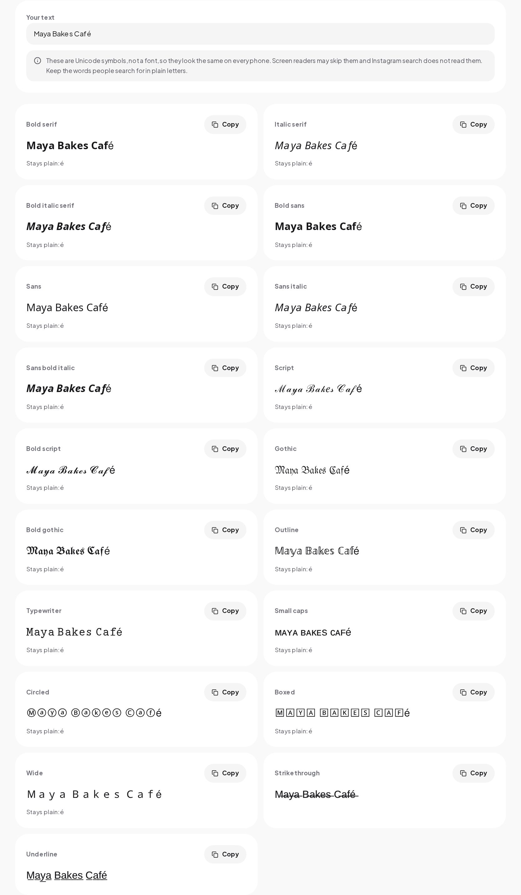
The nineteen styles
| Style | What it suits |
|---|---|
| Bold | Names and short headlines; reads well on a small screen |
| Italic | A single word of emphasis |
| Bold italic | A short tagline |
| Script | One or two words, such as a name |
| Bold script | A name that should feel personal |
| Gothic (fraktur) | Brands with a dark or vintage look, in small doses |
| Bold gothic | The same, a little heavier |
| Double-struck | Short labels and initials |
| Sans | A clean, modern line that still stands apart |
| Sans bold | Headlines in captions and bios; one of the most readable |
| Sans italic | A soft emphasis |
| Sans bold italic | A short, punchy line |
| Monospace | A typewriter or tech feel |
| Small caps | Subtle labels |
| Circled | Decoration, initials |
| Squared | Short labels in capitals |
| Fullwidth | Wide, spaced letters for a statement |
| Strikethrough | A joke or a crossed-out price |
| Underline | Emphasis on a word |
Bold and sans bold are the most readable on a phone. Script and gothic are striking but tiring to read in more than a few words.
Why some letters stay plain
Unicode only has styled versions of the basic Latin letters A to Z and, for some styles, the digits 0 to 9. Letters with accents or marks, such as é, ü, ç, ş, ğ or ı, have no styled twin. Neither do letters from other alphabets, punctuation or emoji.
The generator leaves those characters exactly as they are and tells you which ones stayed plain, so you are not surprised. A word like "Café" in script will mix a styled "Caf" with a plain "é". If that looks odd, choose a style where the mix is less visible, such as sans bold, or rephrase.
A few styles also borrow some letters from older blocks of symbols. Script and double-struck, for example, take a handful of capitals from a set designed for physics and math. They look right, but they are a reminder that this is a collection of symbols, not a typeface.
Where styled text helps
- Your display name, as decoration around a plain keyword. A styled first name next to a plain "Sourdough classes" can stand out without hiding the searchable part.
- Section labels in a bio. A short bold label such as "Classes" or "Shop" helps a bio scan.
- Headlines in long captions. A bold first word on each step of a carousel caption guides the eye.
- Comments and replies, where a styled word or two adds personality.
Where styled text hurts
Search
Instagram search matches the plain word. A name written in bold symbols does not match a search for the same word in normal letters, because to Instagram they are different characters. If your name field says "Maya Bakes" in script, someone searching "Maya Bakes" may not find you through the name. The same goes for keywords in your bio.
Keep the words people search for in plain letters. Style the decoration, not the keyword.
Accessibility
Screen readers, which blind and low-vision people use to hear what is on screen, read these symbols by their technical names, spell them out or skip them. A styled bio can sound like a string of "mathematical bold capital M, mathematical bold small a..." or like nothing at all. Use styles for a word or two, never for whole sentences that carry information.
Readability
Script, gothic and circled letters are hard to read quickly, especially at small sizes. A caption written entirely in script asks a lot of someone scrolling. Readers who struggle will not try harder; they will scroll on.
Usernames are different
Styled letters cannot be used in your username, the handle after the @. Instagram usernames allow only letters, numbers, periods and underscores. Styles work in the display name, the bio, captions, comments and story text. For ideas on the handle itself, the Instagram Username Generator builds options that follow Instagram's rules.
Will it look the same everywhere?
Mostly, yes. Modern phones and computers include fonts that can draw these symbols. On older devices or in some apps, a rare symbol may show as an empty box. Bold, italic and sans styles are the most widely supported; circled and squared letters are a little less so. If your audience includes many people on older phones, stick to the common styles.
Using styled text well
- Pick one style and use it consistently. A profile in five styles looks chaotic.
- Style one to three words, not sentences. A styled word stands out because the rest is plain.
- Keep keywords plain. Your niche, your city, what you sell and your name, if people search for it.
- Read it on your phone. Check how it looks in the app, at the real size, before you save.
- Mind the bio limit. Styled letters still count toward the 150-character bio limit. The Bio Optimizer counts characters and checks the rest of your bio.
Styling your text in a minute
- Open the Instagram Font Generator and type a name, a headline or a short line. Letters and numbers change; emoji and punctuation stay as they are.
- Scroll the nineteen styles and look for the one that fits your brand.
- Check the note under any style where some letters stayed plain.
- Copy the style and paste it into Edit profile, a caption or a comment.
A styled name, a plain keyword, a fast reply
A styled name earns attention; a clear bio with a keyword turns it into a message. When the bio says "DM me CLASS for dates", someone has to answer, ideally before the visitor leaves the app. With keyword automations in ChatinFlow, that word gets a reply in seconds, with the dates, the link or the booking page, day and night.
Quick answers
How do I change the font on Instagram?
You cannot change the font itself. Type your text in a generator, copy one of the styled versions and paste it into your bio, name, caption or comment.
Are Instagram fonts safe to use?
Yes. Instagram accepts them like any other character. The trade-off is that search does not match styled letters to normal words and screen readers may not read them.
Why do some letters not change?
Unicode only has styled versions of the basic Latin letters and digits. Accented letters, other alphabets, punctuation and emoji stay plain.
Sources
- Mathematical Alphanumeric Symbols chart, The Unicode Consortium.