The full guide
The complete guide to Reels and TikTok safe zones
A vertical video has two layers. One is yours: the picture, the words on screen, the product in your hand. The other belongs to the app: the username, the caption, the sound line, the like, comment and share buttons, the header and on TikTok a navigation bar.
A vertical video has two layers. One is yours: the picture, the words on screen, the product in your hand. The other belongs to the app: the username, the caption, the sound line, the like, comment and share buttons, the header and on TikTok a navigation bar. The second layer sits on top of the first, and whatever it covers is gone for the viewer. The safe zone is simply the part of a 9:16 frame that the app leaves alone.
It sounds like a small design detail. In practice it decides whether people can read your offer, see your face and act on your call to action. A "Comment LINK" that sits under the caption is a call to action nobody sees, and a reel that asks for comments but hides the keyword gets far fewer of them. This guide explains where each app puts its interface, how to keep your important pixels clear, and how to check a reel in under a minute before you post it.
What the apps put on top of your video
Instagram Reels, Instagram Stories and TikTok all play full screen at 1080 by 1920 pixels, a 9:16 frame. The layouts differ, but the logic is the same: account details and text at the bottom, actions on the right, controls at the top.
| Layer | Instagram Reels | Instagram Story | TikTok |
|---|---|---|---|
| Top | Reels title and camera | Progress bar, profile and time | Following and For You tabs |
| Bottom | Username, Follow, caption, sound | Reply field, like and send | Username, caption, sound, nav bar |
| Right side | Like, comment, share, more, audio | None | Profile, like, comment, save, share |
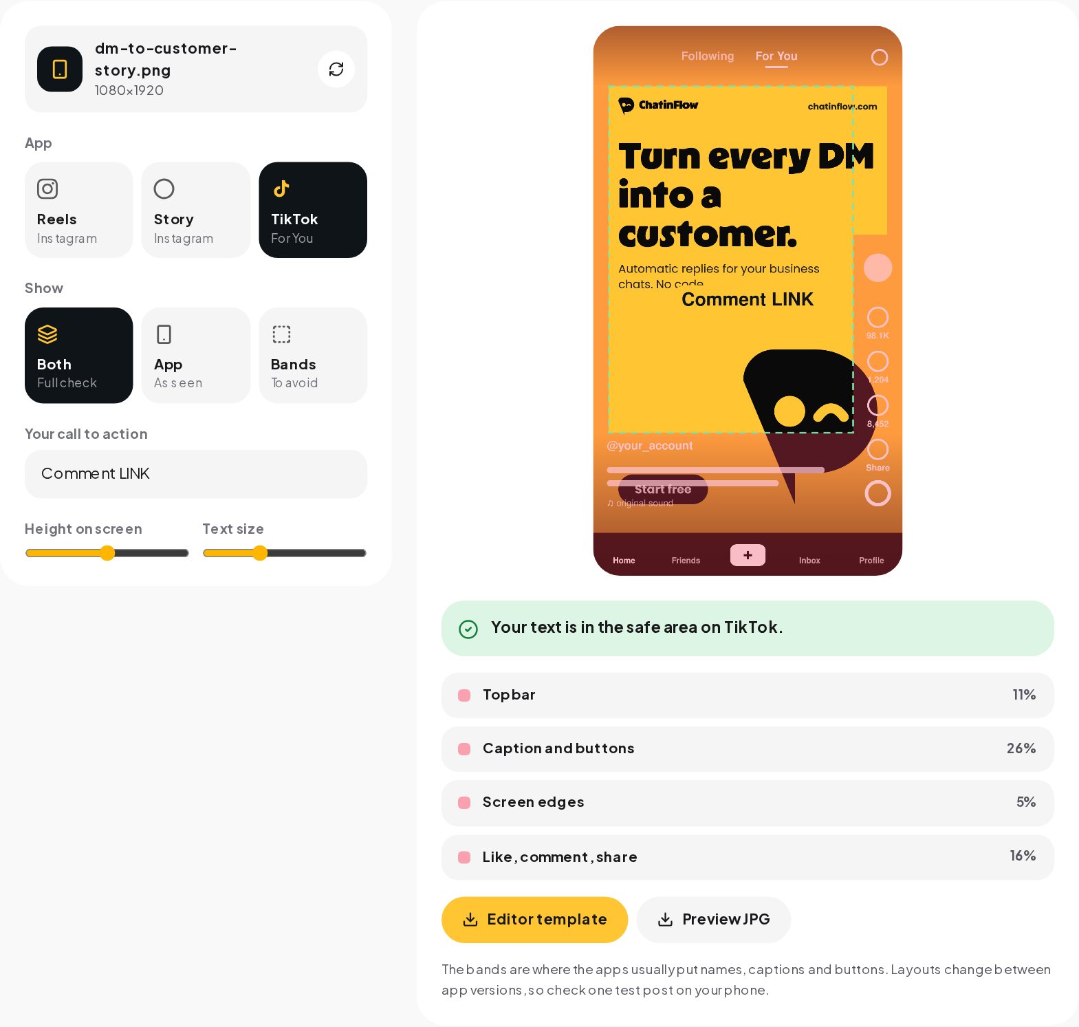
| Bands we keep clear | 14% top, 35% bottom, 17% right | 14% top, 20% bottom | 11% top, 26% bottom, 16% right |
Neither Meta nor TikTok publishes one fixed figure for organic posts, and both change their layouts between app versions and between phones with different screen shapes. For Reels ads, the margins most guides cite from Meta's ad specs are 14 percent at the top, 35 percent at the bottom and 6 percent at each side. The Safe Zone Checker uses those same cautious bands for Reels and adds the column of buttons on the right, which covers the lower half of the frame.
Where to put text, faces and your call to action
The clear area is roughly the middle of the screen: below the top seventh, above the bottom third, and away from the right edge. Everything that carries meaning belongs there.
- On-screen text. Hooks, prices, steps and keywords go in the middle band. Large text near the top competes with the header and is the first thing people cover with a thumb.
- Faces. Eyes in the upper middle of the frame read as natural and stay clear of the caption. A face at the very bottom ends up behind the username.
- Products. Hold or place the product around the center. A product on the right edge disappears behind the like and share buttons.
- The call to action. "Comment LINK", "DM PRICE" or "Tap the link in bio" works best slightly above the middle, large and on a solid label, so it survives compression and small screens.
- Subtitles. Burned-in captions should sit above the bottom band. Many editors place them at the bottom by default, right where the app caption goes.
Why the middle works better than the top
It is tempting to put the hook at the very top because that is where people look first. The header and the status bar sit there too, and the top of the frame is also what gets cropped in the profile grid. Text that starts just below the top band is read just as fast and is never covered.
How to check a reel before you post
You do not need to post a test reel to see what the app hides. The checker draws the interface over your own frame in the browser.
- Open the Safe Zone Checker and choose a cover image or the video itself. A video opens at its first frame; slide to the moment you want to check, such as the frame where your call to action appears.
- Pick the app: Instagram Reels, Instagram Story or TikTok. Switch between "App" to see it as viewers do, "Bands" to see the areas to avoid, or both.
- Type your call to action, then move it up and down and change its size. The checker tells you at once whether it is clear or which part of the interface covers it, and how much.
- Download a preview to share with a client or a teammate, or download the template for your editor.

Using the overlay template in your editor
The template is a transparent 1080 by 1920 PNG with the bands shaded. It turns any editor into a safe zone checker while you edit.
CapCut
Add the template as an overlay on the top track, stretch it to the full frame and lower its opacity to about half. Lock the track if your version allows it, edit underneath, then hide or delete the overlay before you export.
Premiere Pro and Final Cut
Import the PNG, drop it on the highest video track and set it to the length of the sequence. In Premiere, an adjustment of opacity on the clip is enough; in Final Cut, put it on a connected storyline above the main one. Disable the track before export.
Canva
Upload the PNG, place it over your design at full size and lower its transparency. Group your design elements underneath, then delete the template before you download.
Safe zones for covers and the profile grid
The cover of a reel has two jobs: it is the first frame people see in the feed and the tile that represents the reel on your profile. The profile grid shows only the middle 3:4 of a 9:16 cover, which means 240 pixels disappear from the top and from the bottom. A cover title that reads in the reel can be cut in half on the profile.
Keep the cover title inside the middle band and you solve both problems at once. The Reels Cover Maker shows the grid crop next to the full cover while you write the title.
Common mistakes and how to fix them
- The keyword in the caption only. Many people never open the caption. Put the keyword on screen as well, in the clear area, and say it out loud.
- Text that moves into the bottom band. Animated captions that slide up from the bottom spend their first half second under the app caption. Start them in the middle.
- Thin fonts. Every app compresses video. Thin strokes break up and small text blurs first, so use bold type at a size that reads on a phone held at arm's length.
- Designing on a desktop preview. A laptop preview shows the whole frame. Check on a phone or in the checker, which shows what the app really leaves.
- One layout for every app. TikTok's buttons start higher than Instagram's and its navigation bar adds a strip at the bottom. If you post the same video to both, check it against both layouts.
- Forgetting the Story reply bar. Stories have no button column but a wide reply field at the bottom. A sticker or link placed low in a Story often sits right under it.
Organic posts, ads and different phones
Ads have their own placements and their own rules. The Reels ad margins are close to the bands in this guide, and Meta's Ads Manager shows a safe zone preview for each placement. TikTok ads add a larger bottom area for the ad label and button. If a video will run as an ad, build to the tightest placement you plan to use.
Phones differ too. Taller screens show slightly more of the frame at the top and bottom, and the apps adjust their interface to notches and gesture bars. That is why the bands in the checker are cautious rather than exact: content inside them is clear on every common phone, while content right at the edge of a band may be visible on one phone and covered on another.
Planning a reel around the safe zone
The easiest way to keep a reel clear is to plan for the bands before you film, not to fix it in the edit.
Frame the shot with room at the bottom
When you film yourself, leave space under your chin. If the camera crops at the chest, your face lands in the upper middle and the caption has empty space to cover. Phone camera apps can show a grid; the lower horizontal line of a 3 by 3 grid is close to where the bottom band starts on Reels.
Time the text, not just its place
On-screen text has to be there long enough to read: a short line needs about a second and a half, a full sentence two to three seconds. A keyword that appears for half a second in the middle of the reel is technically in the safe zone and practically invisible. Show the call to action at least twice, once early and once in the last seconds, when people decide whether to comment.
Keep a frame for the cover
Plan one clean frame with the subject in the middle and room for a title. It becomes the cover, so you do not need to design one from scratch later, and it already respects both the reel bands and the profile grid crop.
Write the keyword the way people will type it
A call to action works when it is short, easy to spell and in capitals: LINK, PRICE, GUIDE. If you plan to answer comments automatically, use the exact word your automation listens for, on screen and in the caption, so every comment that asks gets the answer.
A checklist before you post
- The hook, the call to action and any price sit in the middle band.
- Nothing important touches the right edge of the lower half.
- Burned-in captions start above the bottom third.
- The call to action is large, bold and on a solid label.
- The cover title stays inside the middle 3:4 for the profile grid.
- You checked the layout for every app the video goes to.
- You watched one test on a phone, with the sound off.
From a visible call to action to a conversation
A clear "Comment LINK" is the start of a funnel, not the end. Each comment is a person asking for something, and they expect it fast. With keyword automation, ChatinFlow answers every comment that contains your word with a DM that carries the link, the price or the booking slot, in seconds and at any hour. The safe zone makes sure people see the word; the automation makes sure nobody waits after they type it.
Quick answers
How much of a reel does the interface cover?
In the checker's layouts, about the top 14% and the bottom 35% on Instagram Reels, plus a column on the right where the buttons stand. Stories lose about 14% at the top and 20% at the bottom.
Is the TikTok safe zone the same as Instagram's?
Close, but not the same. TikTok's header is a little shorter and its caption area a little lower, about 11% at the top and 26% at the bottom, with the buttons on the right.
Do ads need a different safe zone?
Ads add a sponsored label and a call to action button. Design to the cautious bands and check the placement preview in Ads Manager before you publish a paid post.
Sources
- Image resolution on Instagram, Instagram Help Center.